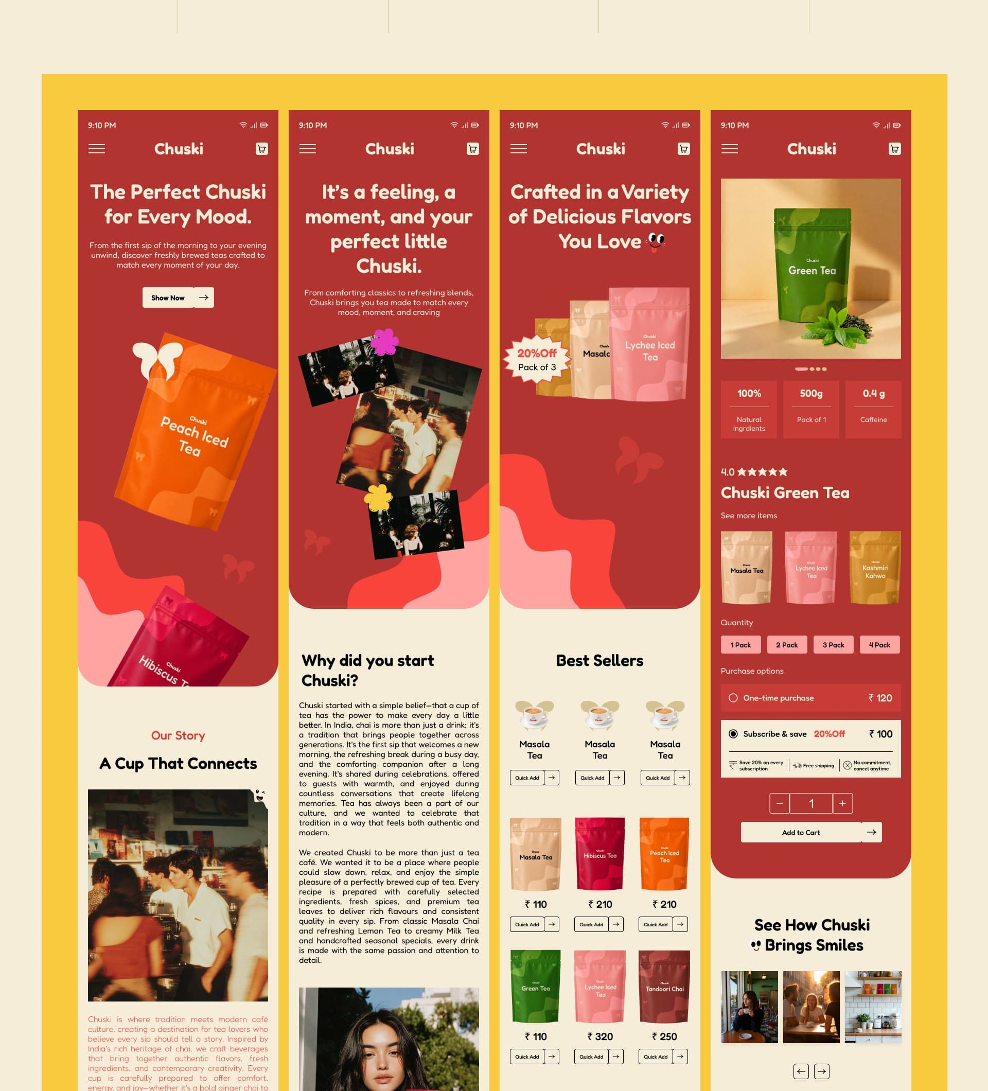
Chuski Website Design
An online tea ordering experience that keeps the warmth of a neighbourhood tea café instead of feeling like another delivery app
- Project Type
- An Online Tea Ordering Website
- Duration
- 2 Weeks
- Role
- UX Research, Wireframing, UI Design
- Design System, Prototype
- Tools
- Figma, Illustrator, Claude, Chat GPT
About Chuski
Tea is much more than just a beverage in India. It represents conversations, comfort, small celebrations, work breaks, family gatherings, and everyday routines.
While exploring online tea ordering platforms, I noticed that many websites focus only on completing transactions quickly. They rarely capture the emotional warmth and community feeling that people associate with having tea.
I wanted to design an experience where users could order tea online for quick delivery, browse different tea varieties easily, and feel the warmth and personality of the brand throughout the journey.
01Problem
Most local tea brands either
- Ignore storytelling and emotional connection
- Feel like generic food delivery platforms
- Don't communicate their brand personality
- Focus only on ordering
- Have outdated websites
Design Challenge
Design a digital tea ordering experience that makes users feel the warmth and connection of a neighborhood tea café while offering a fast, intuitive, and convenient ordering journey from discovery to checkout.
02Approach
I wanted to explore how emotional branding and efficient UX could work together.
Instead of designing another food delivery website, I focused on creating a tea-first experience where people could:
- Discover products
- Learn about the brand
- Enjoy browsing
- Quickly place an order
- Also feel invited to visit the café.
03Color Palette
- Maroon#B23430
- Red#C73C37
- Vivid red#F9443B
- Indian Red#D95955
- Pastel red#FFA4A0
- Buttercream#F5EDD7Base surface
- Light beige#F1E7CC
- Beige#D3C293
- Black#000000
- Orange#FF7B2A
- Pink#E53BC0
- Yellow#F7CB3D
- Blue#2666BF
04Typography
I chose Fredoka because its rounded, friendly style reflects Chuski's warm and welcoming personality. It creates a cozy café feel while maintaining a modern look. The font is easy to read across desktop and mobile, making the experience approachable, comfortable, and accessible for a wide range of users.
- Primary
- FredokaHeadings, product names, UI labels
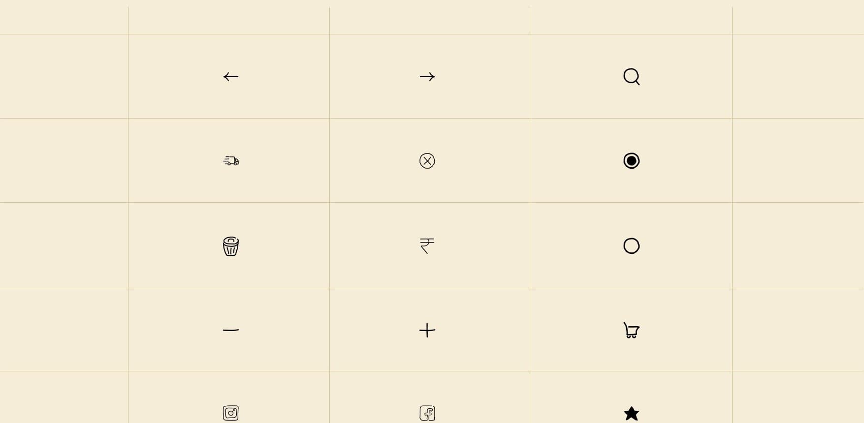
05Freehand Icons
I chose hand-drawn icons to give Chuski a warm, friendly, and handcrafted feel. They reinforce the brand's cozy café personality, add a unique visual identity, and make the interface feel more personal while remaining simple and easy to understand.
06Final Design
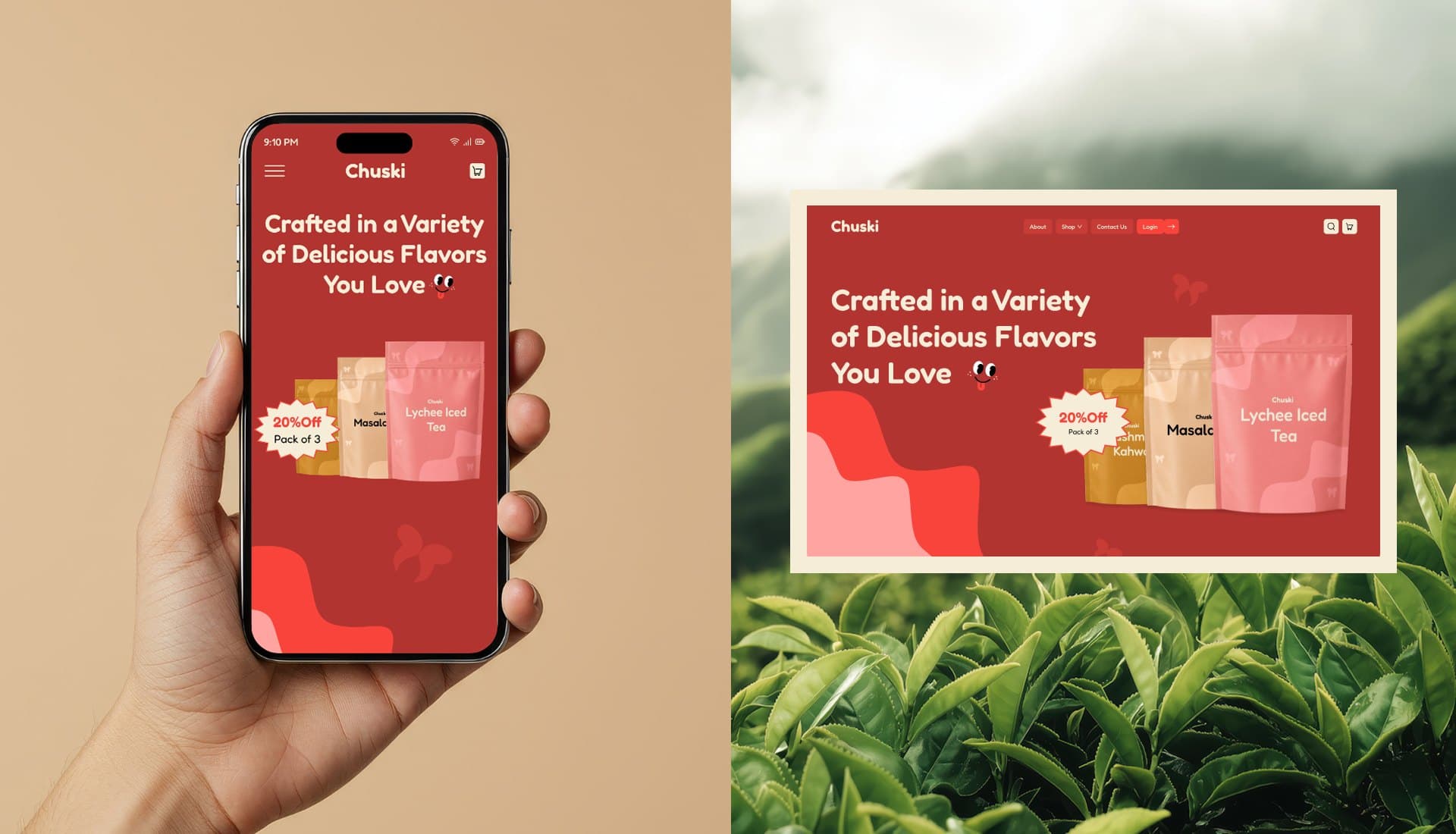
A tea-first storefront — the landing page leads with mood rather than menu, so browsing feels like visiting rather than transacting.
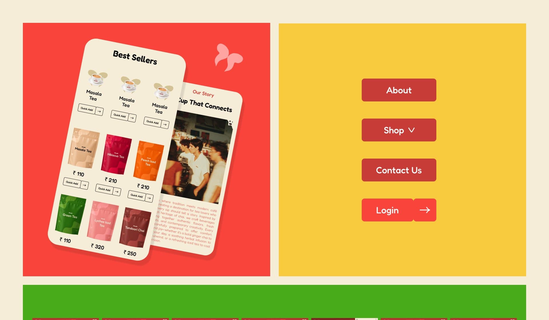
Browsing and quick add
Every product card carries a Quick Add control, so a repeat order takes one tap from the grid.
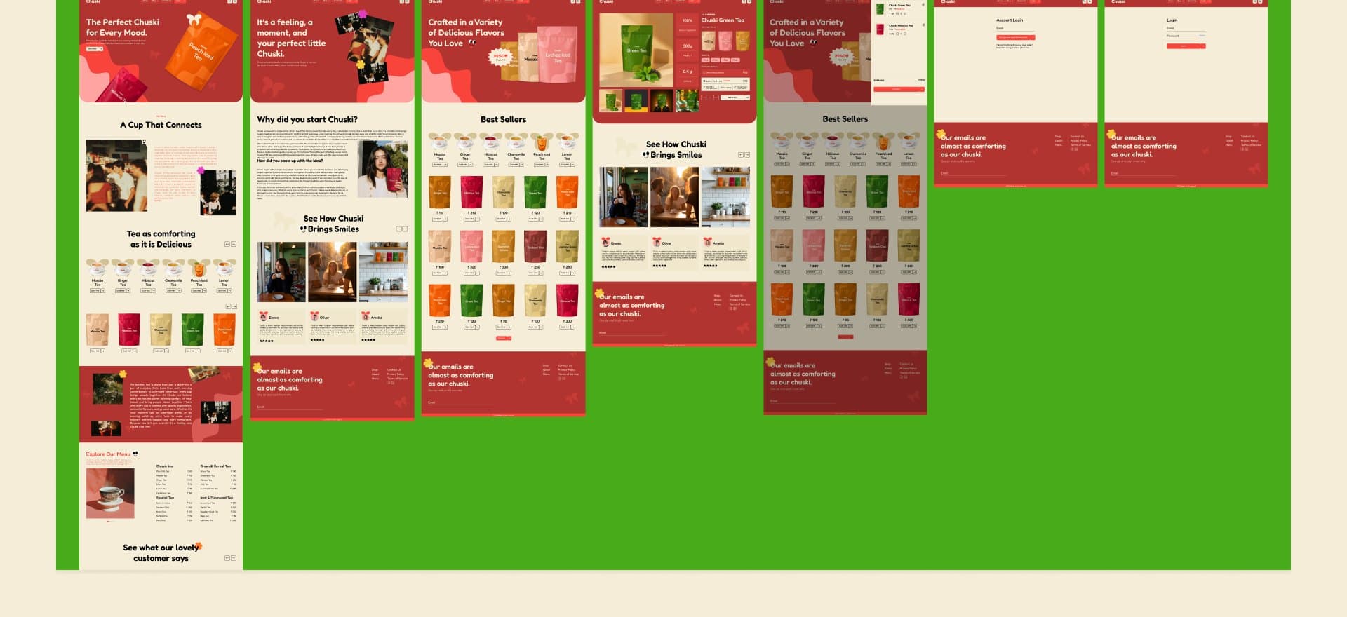
The full flow
Landing, about, shop, product detail, cart and login — one system, one voice.
Mobile
Rebuilt for a phone — full-bleed hero, scrollable product rails, and the key product facts up front.